 MAKER GULLY

Years ago I wrote a Medium piece on universal design for color blindness. Hot air balloons. Cone cells. Bang Wong's palette. Charts that still work in black and white.
I was writing as someone who cared about inclusivity in the abstract. Now I ship products where color is often doing real work: yarn spindles in Knit-Knot, neon tiers in Spatial Patch, scores and status on Feeder Rater, light and dark on makergully.com. The theory did not get smaller. The blast radius did.
If one in twelve men and one in two hundred women have some form of color vision deficiency, a "pretty" UI that only works for trichromatic eyes is not a taste choice. It is a product that quietly fails a chunk of the people who open it.
The balloons still make the point
This photo is from the Plainville Balloon Festival - bright day, sharp colors, the version someone with typical color vision sees.

Run the same frame through a color-blindness simulator and the picture splits into different worlds: deutan, protan, tritan, and the rest. Same balloons. Different information.
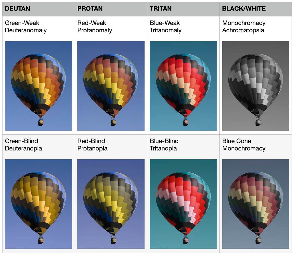
That collage is why I keep coming back to the old essay. If your interface only works in the top-left version of reality, it does not work.
What I got wrong when I only wrote about it
The old article treated color blindness like a presentation problem. Fix the slide deck. Label the pie wedges. Stop saying "the blue box."
That advice still holds. But a solo product has sharper edges.
When Knit-Knot asks someone to sort yarn by color, color is the mechanic. When a dashboard uses red text for emphasis on a dark background, color is the warning system. When a status pill is only "green means good," color is the entire sentence.
Universal design is not a coat of paint you add after the feature ships. It is whether the feature can still be understood when color stops being trustworthy.
The practical rules I carry into Maker Gully
I still lean on the same principles I wrote about then. I just apply them to software I have to maintain at 2am.
- Never let color be the only signal. Pair it with shape, position, pattern, weight, or plain language. In a puzzle, different tile shapes or labels beat eight hues that collapse into two under deuteranopia. On a marketing page, a store pill that says "Web" is clearer than a tint alone.
- Check contrast in both themes. Maker Gully follows the OS with light and dark tokens on purpose. Dark mode is not a vibe filter. Secondary text has to stay readable against the background, or you have built an interface that only works at noon.
- Prefer palettes that survive simulation. Vivid, well-separated hues beat subtle gradients that look sophisticated to you and muddy to someone else. If a diagram only works in full color, it does not work.
- Say the thing out loud in the UI. "High score," "needs water," "try again" beat a lone amber badge. Verbiage is accessibility. So is putting the label on the thing instead of hiding meaning in a color key off to the side.
- Test the hostile view. Run a color-blindness simulator on screenshots. Squint. Print in grayscale. If the game or the score still makes sense, you are closer. If it turns into noise, the design was borrowing meaning it did not earn.
None of this requires a research lab. It requires refusing to ship a UI that only you can parse.
Why this matters more when you are a team of one
There is no accessibility specialist waiting to file a ticket. There is no design critique next Thursday. There is you, a simulator, and the knowledge that roughly eight percent of male users may be playing a different game than the one you think you built.
That sounds heavy. It is also leverage. The same habits that help color-blind players help everyone else: clearer labels, stronger structure, interfaces that survive bad lighting, cheap phones, and distracted thumbs.
Curb cuts were built for wheelchairs and ended up helping strollers and luggage. Designing so color is not the only door usually makes the product clearer for people with perfect vision too.
I wrote that Medium piece as advice for presenters and diagram-makers. I keep it now as a build rule for Maker Gully. The balloons still look different under every simulation. The job is to make sure the product does not disappear with them.
The original essay is here if you want the longer walkthrough: Universal Design on Medium.
That's the reality of being a team of one.
#TeamOfOne #BuildInPublic #UniversalDesign #Accessibility #IndieHackers